Thirst: the vampire chic version
by javabeans
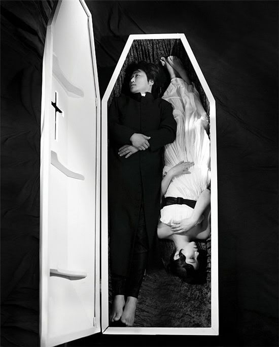
These new photos themed around Oldboy director Park Chan-wook‘s latest film, the vampire horror movie Thirst [박쥐], take a decidedly less shocking approach than the previously released teaser poster, which had received a bit of criticism for being too provocative.
(In response to the public reaction, the bat-like imagery of the legs — as the Korean title literally translates to “bat” — were removed digitally to produce a more toned-down version, although personally I think the original is striking and badass.)
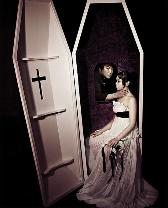
These new shots are for fashion mags Vogue and Cosmopolitan, which explains why they’re a lot less scary than the film’s dark trailer (which you can watch at the abovelinked post). Featured are the movie’s two leads, Song Kang-ho and Kim Ok-bin, while the images give off an almost campy effect, sorta like the Hello, Franceska version of vampire lore as opposed to the actual horror movie. But they are very pretty.
As one of the year’s most-anticipated films, Thirst opens in theaters on April 30.
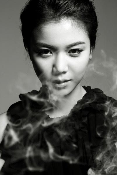
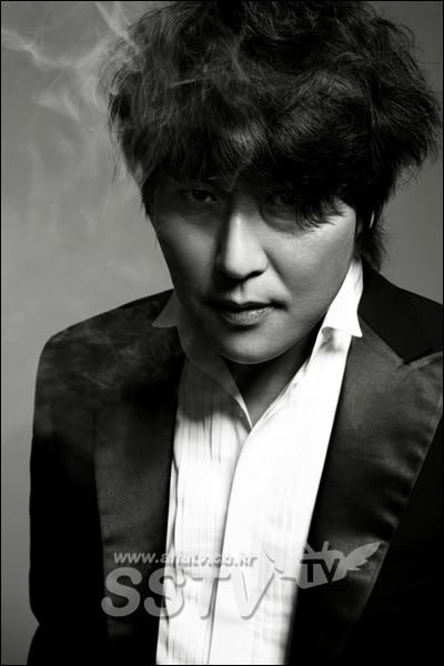
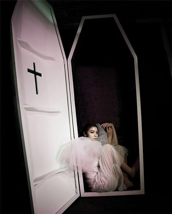
Via Star News
RELATED POSTS
Tags: Kim Ok-bin, Park Chan-wook, Song Kang-ho


![[Beanie Recs] Feel-good fantasy?](https://d263ao8qih4miy.cloudfront.net/wp-content/uploads/2022/05/BeanieRecs.jpg)


![[Beanie Review] A Virtuous Business](https://d263ao8qih4miy.cloudfront.net/wp-content/uploads/2024/10/AVirtuousBusiness_reviewb.jpg)


Required fields are marked *
Your email address will not be published. Required fields are marked *
1 selva
April 19, 2009 at 4:21 AM
I like the one with his hand holding her neck from inside the coffin! but how I wish if he tilted his body a little bit to the left like the coffin! although I still find the 1st poster better!
really looking forward to watch this movie.
Required fields are marked *
2 Jane
April 19, 2009 at 4:26 AM
These shots are beautiful! Can't wait till the movie comes out.
(I liked the original poster better, too.)
Required fields are marked *
3 jdb
April 19, 2009 at 5:03 AM
Nothing beats the original….oh I mean the first released poster …its intriguing and eye catching which I think did its purpose to evoke reactions weather bad or good promoting the movie. This 2nd batch is not bad either with Mr. Park caliber as a director hope its worth to watch… I can’t wait to be scared once again…lol…
Required fields are marked *
4 Sere
April 19, 2009 at 6:52 AM
Oh nice shots, but I, too, think the original poster was better! Whether you liked it or not, it sure caught your attention!
Required fields are marked *
5 Joanna
April 19, 2009 at 7:26 AM
I'm a timid person and never liked looking at coffins, needless to say take a glance at its contents. But this one successfully caught my attention. Great shoot. o.o
Required fields are marked *
6 missglasses
April 19, 2009 at 8:00 AM
I was so shocked when first time seeing those pictures. They're so artistic, I like the photoshoots :D
Required fields are marked *
7 tarayqen
April 19, 2009 at 9:01 AM
one of the best themed photo spread ive seen so far.... i thought that they were even posters for the movie......
Required fields are marked *
8 tiffany80
April 19, 2009 at 10:10 AM
aww. the original was awesome, but i like these too.
Required fields are marked *
9 diana
April 19, 2009 at 11:48 AM
i always love park chan wook's works!!^^ hopes this one is as good as his other works....
Required fields are marked *
10 travp16
April 19, 2009 at 11:54 AM
i like the photos,. I am sooo stoked for this film!!!
Required fields are marked *
11 kimchii
April 19, 2009 at 1:39 PM
I love the head shot of Kim Ok Bin.
Required fields are marked *
12 ed
April 19, 2009 at 3:44 PM
very caligari/nosferatu eh.
i'm guessing the coffin shape is not common in korea, so this is more exotic and cool than scary?
Required fields are marked *
13 Jin-Ah
April 19, 2009 at 5:15 PM
I agree with you JB.
I prefer the original shot, definitely feel it shouldn't have been changed.
Required fields are marked *
14 SodaBoxThrone
April 19, 2009 at 9:43 PM
I am torn between whether this or Mother will be my most anticipated film of the year, but I LOVE this shoot....the second coffin picture is meant to emulate a catholic confessional, which I find to be an awesome bit to throw in there....it is a subtle and morbid bit to throw in there unless you know what it is, in which case it's unmistakable....if that makes sense. XD
I'm sorry, I'm not eloquent this week.
Required fields are marked *
15 asarako
April 19, 2009 at 11:37 PM
ahmmm this pic are okay but not catchy like the first poster......
Required fields are marked *
16 Jill
April 19, 2009 at 11:55 PM
hey! where's Shin HaGyun????!!
Required fields are marked *
17 belleza
April 20, 2009 at 10:37 AM
"i’m guessing the coffin shape is not common in korea, so this is more exotic and cool than scary?"
Upon seeing the picture, I first thought "hmm, the sex must be great! I wonder if they do it during service. "
Required fields are marked *