Kim Hyo-jin in Harper’s Bazaar
by javabeans

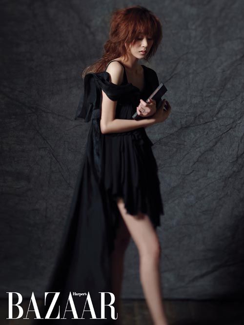
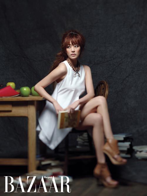
You’ve probably noticed that it’s that time of month again, when fashion rags tease their upcoming issues with previews of celebrity photo spreads. This one features actress Kim Hyo-jin (Mary Stayed Out All Night) in the April issue of Harper’s Bazaar, which is centered around the theme “intelligent and sexy.” If by intelligent you mean posing with books and crawling over a typewriter as though having your way with the device somehow imbues you with its literary powers. (If only!)
According to a rep with the magazine, “We thought of the concept for a long time. Kim Hyo-jin loves reading and has discerning taste, so we built the theme around her.”
But what I like most about this shoot isn’t Kim herself (although she is pretty in it), but the photographer’s choice to blur out the borders, as though hyper-focusing the lens on only the very center and allowing the rest to fade out. I’m sure there’s a technical term for that; all I know is, to my layman’s eye, it produces an interesting effect.
Now, if only these editorial shoots could show some creativity in the actual concepts…


Via OSEN
RELATED POSTS
Tags: Kim Hyo-jin
![[K-Movie Night] A Year-End Medley](https://d263ao8qih4miy.cloudfront.net/wp-content/uploads/2024/12/YearEndMedley_1-scaled.jpg)

![[2024 Year in review] Actors bringing their A-game](https://d263ao8qih4miy.cloudfront.net/wp-content/uploads/2024/11/Jeongnyeon1112-00182.jpg)


![[2024 Year in Review] Beanie Awards](https://d263ao8qih4miy.cloudfront.net/wp-content/uploads/2024/12/beanieawards_2024.jpg)


Required fields are marked *
Your email address will not be published. Required fields are marked *
1 Lost without KDramas
March 26, 2011 at 5:19 AM
Not surprisingly she looks so much better than she did in MSOAN.
Required fields are marked *
mary
March 26, 2011 at 5:43 AM
Really?
I thought MSOAN had great stylists. Didn't it have that good looking girl... - oh wait. That was Jang Geun Sook.
Sorry. My bad.
Required fields are marked *
Lost without KDramas
March 26, 2011 at 5:56 AM
MSOAN did have great stylists. I just like Kim Hyo-jin with the longer hair. It does help though that Jang Geun Sook isn't around to take the attention with his luscious locks.
Required fields are marked *
sam
March 26, 2011 at 8:24 AM
No NO the girl with bang wasn't jang geun suk who has wore simar and had long orange hair was him.
Required fields are marked *
malia
March 26, 2011 at 10:57 AM
HAHAHA
Required fields are marked *
drama fever
March 26, 2011 at 1:13 PM
I think she alway looks so pretty even when she is in MSOAN. Though, in the first pix she looks cross-eyed for some reason.
Required fields are marked *
Ms Guccibabie
March 26, 2011 at 5:08 PM
not cross-eyed just a little surprised, that's all. "what! oh you just my picture. oh o-kay."
Required fields are marked *
2 SpongeBob
March 26, 2011 at 5:53 AM
Is she YJT's girlfriend?
Required fields are marked *
♥
March 26, 2011 at 11:07 AM
She is!
Required fields are marked *
3 OhBobbi
March 26, 2011 at 6:00 AM
Is it my imagination or does she look really cross-eyed in the first photo?
Required fields are marked *
SpongeBob
March 26, 2011 at 6:32 AM
Hehe.. A bit of cock eye!!
Required fields are marked *
tinpra
March 26, 2011 at 8:07 AM
My thoughts exactly! Camera, or whatever, must have been too close.
Required fields are marked *
Kay
March 26, 2011 at 2:47 PM
no you're right, her eyes actually creep me out in that first picture
Required fields are marked *
4 malta
March 26, 2011 at 6:26 AM
It's great to see someone, especially a celebrity, modeling with books. That's unusual and I like it. The 2nd and 3rd pictures are beautiful. I look at the 2nd one and I wonder where she's going with that book...
Required fields are marked *
SpongeBob
March 26, 2011 at 6:30 AM
Hehe...it is so obvious, that's bedtime story book for YJT!!!
Required fields are marked *
5 Christy
March 26, 2011 at 7:06 AM
wow, she looks gorgeous in these pics! My fave is the profile shot and the last photo. That photography technique is called selective focus btw.
Required fields are marked *
6 Linh
March 26, 2011 at 7:09 AM
Beautiful pictures but she is just too skinny, especially on the last 2 pictures. It's like having just skin and bones. The last picture seems weird, like her arm is 'misplaced' somehow.
Required fields are marked *
7 bella luna ;)
March 26, 2011 at 7:10 AM
i'm pretty sure the blurring was done in photoshop, cuz u can't blur only parts of the background that is within the same depth of field. i think the blurring was done so that the beholder's eyes would focus only to the subject since the books and their details could be pretty much distracting. it makes composition a lot easier.
two things about intelligence and taste: one. i know it's a fashion shoot and the photog probably took liberties with creative license, but i agree with JB that crawling over a typewriter doesn't depict intelligence. as if typers don't already have a lot of body pains to deal with given the long hours of sitting often in non-ergonomic positions. if you're wise, you'd know what's good for you. two. i can't coincide "discerning taste" with taking on that role that she had in msoan.
anyway, she indeed looks pretty and sexy in these photos.
Required fields are marked *
8 ar_arguably romantic
March 26, 2011 at 7:25 AM
I'm a bit disappointed with the photoshoot (like the first pic though). Kim Hyo-jin has definitely looked prettier before.
Required fields are marked *
9 gia
March 26, 2011 at 7:46 AM
nice pic, sexy yeah, but WTF, it's not because she hold the book, that mean intelligent.
Required fields are marked *
10 ujsid
March 26, 2011 at 7:49 AM
she looks good but honestly speaking these photos are giving me a headache!
Required fields are marked *
11 chajjye
March 26, 2011 at 7:59 AM
LOL...Korean magazine creative concept fail. Why do they always do this to us...
I think they shouldn't use the word intelligent...cause I'm not sure how you can look intelligent (unless it means sparkly bright eyes that look sharp and confident...idk)
If they wanted to highlight her love for books, they could have created a library for her or let her curl up by the window with a good book and coffee. LOL. Cliche I know, but at least it works eh? XD
Required fields are marked *
bella luna ;)
March 26, 2011 at 8:12 AM
i totally get what you mean with your suggestions for the concept. they could have made her look unaware while she was reading a book or something, while looking sexy at the same time. in these photos, she looks like she's trying to look intelligent. so conscious of it. the books and the typewriter merely looked like props and not things she's really into. pretentious much?
Required fields are marked *
12 tinpra
March 26, 2011 at 8:09 AM
Am I the only one who had to go searching for her other leg in the 2nd picture? The blurring effect is nifty, but it shouldn't make me wonder how she's managing to stand on her own steam.
Required fields are marked *
13 come2noona
March 26, 2011 at 8:23 AM
So, they were going for "intelligence" huh? The word that came to my mind when I saw the first shot was "nuts".
Required fields are marked *
14 Keylye
March 26, 2011 at 9:04 AM
Ummmmmm, I want to like this, I really do. She isn't doing anything wrong - the poses are kind of interesting. Maybe it's the crappy backdrop? Put her in an office. Or a library! All that crinkly gray/black backdrop swallows her up.
Required fields are marked *
15 watchumlots
March 26, 2011 at 9:56 AM
I don't think she looks pretty at all, she looked prettier and more stylish in MSOAN.
The first shot is horrible, she IS cross-eyed, which is not an attractive look for anyone.
The second shot looks well done, very ethereal.
In the last two poses she looks pathetically skinny with breast implants that are out-of-place with her skeletal physique. And don't get me started on the clunky shoes all the actresses with skinny legs are wearing. Those type of shoes only accentuate the skinniness of legs that resemble chopsticks with knobby knees.
Required fields are marked *
16 LeMonS
March 26, 2011 at 10:39 AM
According to a rep with the magazine, “We thought of the concept for a long time."
If she was really smart, she'd own a laptop. You should have thought about the concept a little more...
Use the typewriter as a bookend.
Required fields are marked *
17 kitten
March 26, 2011 at 10:40 AM
It less the concept and more the model. i'm sure she's an amazing person and all but she's lifeless as a model.
Required fields are marked *
18 nelkk
March 26, 2011 at 11:13 AM
she's looks AWESOME AND EXTREMELY HOT.. i loved her in mary stayed out all night, she's way better here..sexy yup
Required fields are marked *
19 danna
March 26, 2011 at 11:19 AM
I didnt know she was Yoo Ji Tae's girlfriend until the jung sung Woo news broke out last week...damn...all the good ones are taken aren't they?.....anyways I think she looks very pretty here....I just wish there weren't no books
Required fields are marked *
20 zakuropanda
March 26, 2011 at 11:37 AM
Maybe I would get the intelligence vibe more if she was actually looking at the books/typewriter.. Like a lot of people mentioned - they just look like background props - I mean the book is blurred out in one of the pics!!
Required fields are marked *
21 :D
March 26, 2011 at 11:39 AM
she's pretty
Required fields are marked *
22 Christina
March 26, 2011 at 2:18 PM
I'm not sure if anybody mentioned this already, but it's called small depth of field... i think...
Required fields are marked *
bella luna ;)
March 27, 2011 at 4:00 AM
nope it's just photoshop blurring. selective blurring.
let me explain depth of field. DOF is the distance between the nearest and farthest object (from the camera) that appears to be acceptably sharp (clear). when you talk about DOF, you talk about camera-to-subject distance and all those camera and lens manipulation to select which parts of the image you choose to sharpen and which ones to blur - at the taking of the image. if the photographer did the blurring through the camera by narrowing the depth of field and keeping the image of her head sharp, the background would totally be in blur. you can't achieve two DOF's in one image. you can only expand your DOF to make the entire image sharp or narrow it to emphasize and sharpen the image of your subject only.
cameras work just like our eyes. when you focus your sight on something, everything before it and beyond it are not as clear as the object you're focusing on. it has something to do with how our brain works and how light travels hitting the object of our attention and into our eyes.
take for example photo #2. KHJ's face is sharp, but her legs aren't. the DOF could've been so small since her legs weren't so far apart. everything that falls in between the distance from the right leg to the left leg (the one behind) should only be the ones to appear clear. everything in front of her right leg and those behind her left leg should be blurred. but in this photo, we see that the cloth in the background has portions that appear to be sharper than her left leg, while the cloth was placed way beyond the supposed depth of field. another thing is that the hem of her skirt is within the same distance from the camera, so it shouldn't be blurred since her face is sharp.
so these photos were taken with wide depth of field and then portions of each were selectively blurred in photoshop.
Required fields are marked *
23 y
March 26, 2011 at 7:05 PM
she looks like a crazy woman in the 1st and last pics...the other shots were so-so..I wouldn't buy the mag or the clothes ...but that's just me ...and is anybody still using a typewriter in this era ?
she looked better in msoan .
Required fields are marked *
24 laura
March 27, 2011 at 2:16 AM
Can anybody tell me her hair colour ???
Required fields are marked *
25 Blondbs
March 27, 2011 at 10:10 AM
Alas, in the 1st photo she looks just like "Stuart" from Mad TV - here's Stuart on the right: http://images.teamsugar.com/files/usr/1/13254/iggypop4.jpg The only photo I like in the series is the white dress- though she does certainliy look a bit anorexic. At least shows some personality. And that doudle-jointed elbow is just odd.
Required fields are marked *
26 hermosa5790
March 27, 2011 at 6:12 PM
first pic: she looked like a deer caught in a headlight!
Required fields are marked *